Advice & Tutorials
I often share my thoughts & answer questions about making art, I will be collecting these posts on this page.
Please note that these won't be step-by-step tutorials, I'm more interested in teaching understanding why you might do something a particular way and encouraging you to make your own choices than trying to tell you how to do things.
Feel free to contact me if you have any questions or need clarification! And if these thoughts I share are helpful to you, perhaps consider leaving me a tip on ko-fi.
Thoughts On:
I very frequently give the same advice in the discords that I’m in so I thought I’d just go ahead and write a post collecting it all!
Pricing commissions
It’s very difficult to look at your art and try and determine some arbitrary value and end up with a price that is not only fair but also something you can live off of. You could try asking others to arbitrarily value your art, but they’re going to struggle just as much.
So let me detail a much more practical method for determining your prices. First, answer these questions:
- Will this be your primary source of income?
- Are you a bill payer?
Option 1 - You don’t pay bills:
Look up the living wage in your area, multiply it by 2, and that will be your hourly rate.
If your area doesn’t have an established living wage, look up the average living costs of your area and go to option 3.
Why do I say to double it? Because the living wage is calculated based on an 8 hour work day, and studies show that a 4 hour work day is more efficient and practical and that there is nothing to be gained from working beyond that. So, twice the rate, half the hours.
I say living wage over minimum wage because, really, the living wage should be the minimum. You should be earning enough money to live off of.
Taking commissions means you’re setting your own rates and hours. While you specifically may not currently be paying bills, you will be one day & the prices you set have an influence on what prices will be considered normal for everyone. Take that opportunity to improve the industry for us all by setting an example on fair pricing!
Option 2 - You do pay bills, but this is not your primary source of income:
Then any commissioned work you do is you working overtime. Take the living wage x2 or your current wage (whichever is higher), and then multiply that by 1.5x to give yourself an overtime wage, and this will be your hourly rate.
If you’re taking commissions because your job is not enough to cover your bills, take the amount you’re short on each month plus some extra to cover one off things you might need to buy and save up for, then decide how many hours you can spare to work on commissions each month, and divide that total by those hours.
E.g. lets say you could do with an extra £100 each month and can spare an hour a week for commission work, that’d give you an hourly rate of £25. Compare that to the overtime wage we calculated before, and take whichever is higher.
Option 3 - You do pay bills, and this will be your primary source of income:
Calculate your living costs for a month, plus some extra for anything you might need to buy and save up, and divide that by 80 to get your hourly rate. Compare it to the living wage x2, and take whichever is higher.
Do some tests and time yourself while you work
Use the work timer tool that can be found here, and calculate how long it takes you on average to finish pieces.
Then, add at least 2 hours onto that time to account for correspondence, research, and getting familiar with unfamiliar designs (add more if you think this will take you more time, you know yourself. This is all work, and therefore should be included in the price)
Once you have your times, multiply them by your hourly rate, and you have your base prices.
For example, the living wage for me is £9.90. For the sake of simplicity, I will round that up (don’t ever round down) then double it, giving me an hourly rate of £20. If it takes me 2-3 hours with correspondence to finish a character bust, I should then charge £40 - £60 for it.
On discounted rates for multiple characters:
Don’t do this.
For one, it makes it confusing for the client in terms of figuring out at a glance how much something will cost them. And for two, you are doing more work for less. It’s not worth it!
Avoid making your clients having to do percentage calculations when figuring out how much it’s going to cost them, in general.
While it might seem like it would make multi-character commissions more appealing, making it easier to calculate prices is what will actually make that more appealing!
Charge extra for complicated designs & requests
Make a note in your terms & info that these are a base estimate price, and that more complicated designs and pieces may cost more. Also note that multiple revisions may incur additional charges.
Sometimes you might get a client who asks you to redraw things repeatedly, even after giving the go ahead with the sketch… If this happens, charge them for it. You deserve to be paid for the extra hours they are making you work.
Taking Commissions
I recommend taking your commissions through a google form or similar:
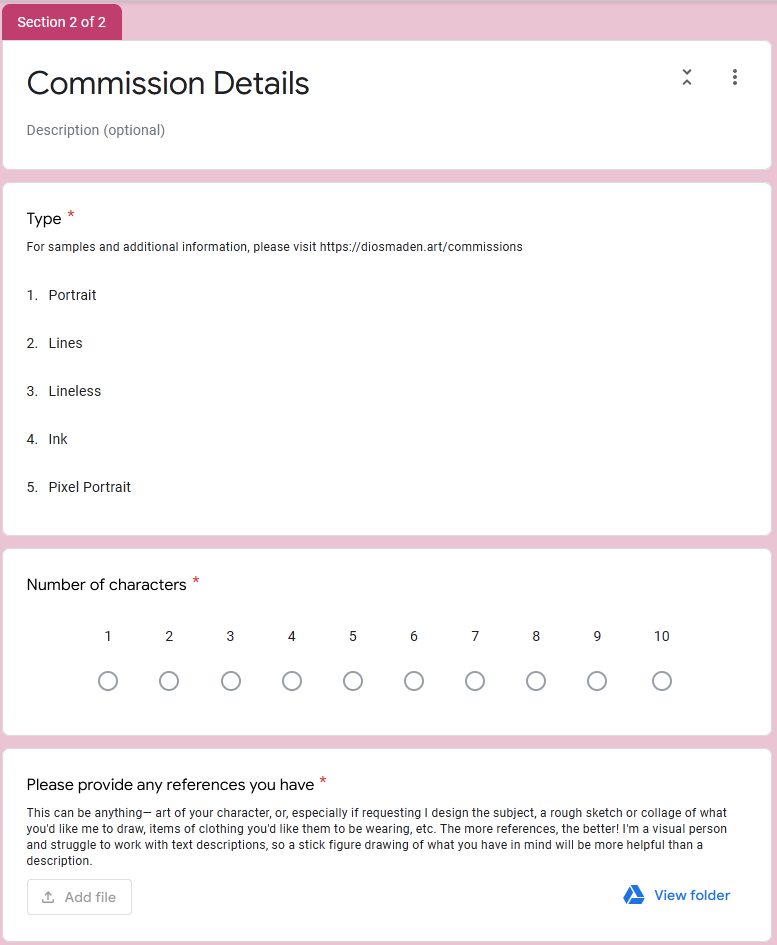
It allows you to ask all the questions you need answers to in order to determine if this is a commission you’re willing and able to take on, without having to go through some awkward small talk as you try and get this information out of your potential client.
It also makes the process easier for your client, as they can simply fill out your form to tell you about the commission you want without having to cold message you about it and try and figure out what details are important to tell you and what aren’t.
Additionally, when using google forms, you can get the advanced form notifications forms addon to automatically email your potential clients after they’ve filled out the form. (Just be aware that if, like me, you’re using firefox the settings do not currently work on FF, you’ll need to manage those through another browser but it should only be a one time setup anyway).
I have the advanced form notifications set up to send a confirmation email to my clients that I will then reply to when I reach them on my list, and also an email sent to myself to let me know that I’ve recieved a new submission.
I use gmail, so I also have it set up to automatically label the confirmation email with an “incomplete” label so I can view all pending commissions in one place.
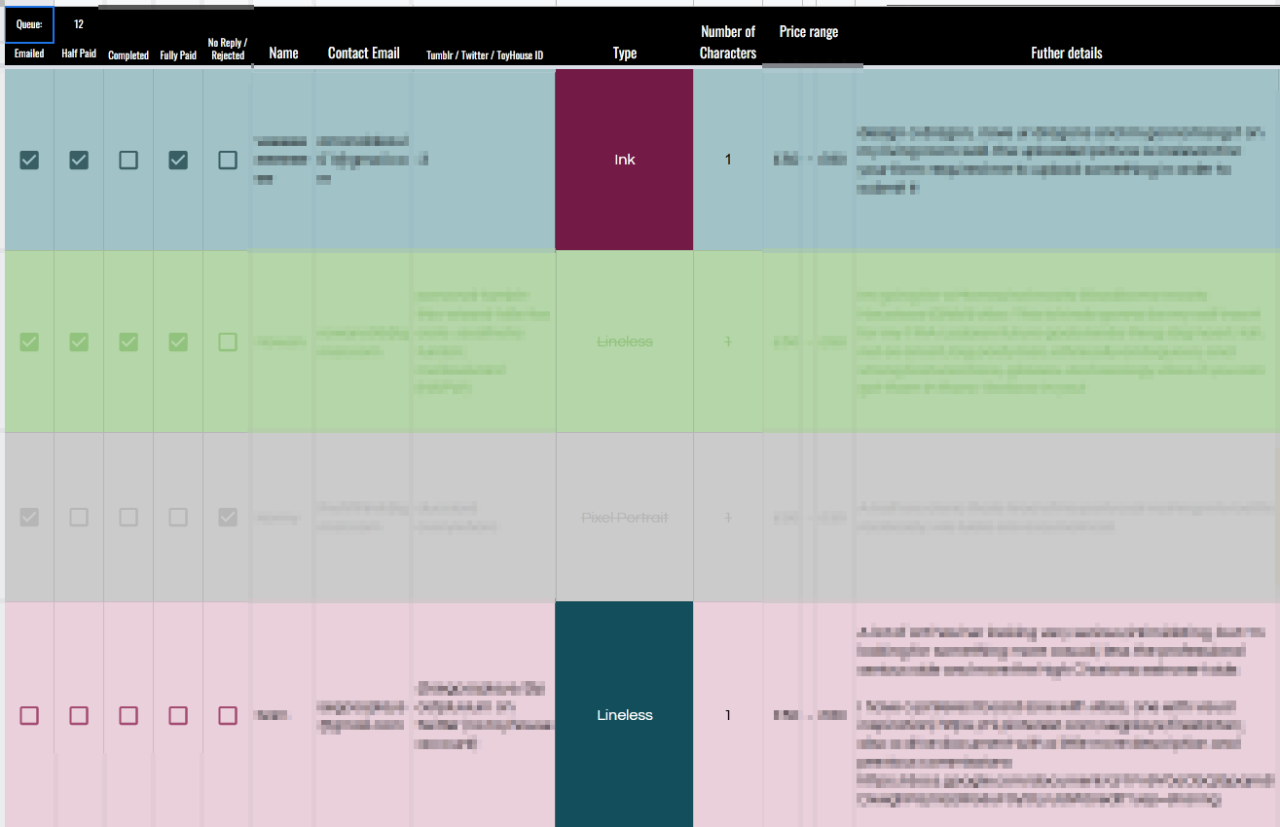
Optional, but I also have my form linked to a spreadsheet. You can mirror the contents of the response sheet onto another sheet using an array formula, allowing you to style it and by using conditional formatting and checkboxes, you can do stuff like this:
—
The way I have my google form set up is the first section reiterates my terms and conditions and requires that the potential client accepts these terms before proceeding onto the next page.
Speaking of, a very important part of taking commissions is your terms. Here are some base terms I would recommend:
- I reserve the right to refuse any commission for any reason without question. [This protects you from any kind of client or commission that makes you uncomfortable.]
- Clients are not permitted, under any circumstances, to use any part of their commissioned artwork for non fungible tokens. Use of the artwork for any advertising or profits associated with non fungible tokens or cryptocurrency is strictly prohibted. [Self explanatory, but sadly important to include now]
- I reserve the right to display the commissioned piece on my website(s), online galleries, and in my portfolios. (If the character is an original character, you will be credited accordingly) [This just lets you post your work on your social media and the like.]
- You may use the commissioned work for personal use only (this includes avatars, signatures, wallpapers, etc.), but credit must be given.
- I reserve the rights of to the artwork, so you may not use the commissioned work for any projects (commercial or nonprofit) without express permission, nor redistribute the artwork as your own. [This protects you from people commissioning you and then profiting off of your work. Commercial commissions should be handled differently with a proper contract & you should charge 3x your base price for it at minimum.]
Accepting payments
I recommend using PayPal invoices to manage your payments. You can set up an invoice template and then and create an itemised list of all your charges, require a minimum of 50% payment upfront, and allow for tips.
You’ll then have a record of your commission payments for tax purposes, and you’ll be protected from fraudulent clients and chargebacks. Just make sure you disable shipping if you’re not sending them a physical piece!
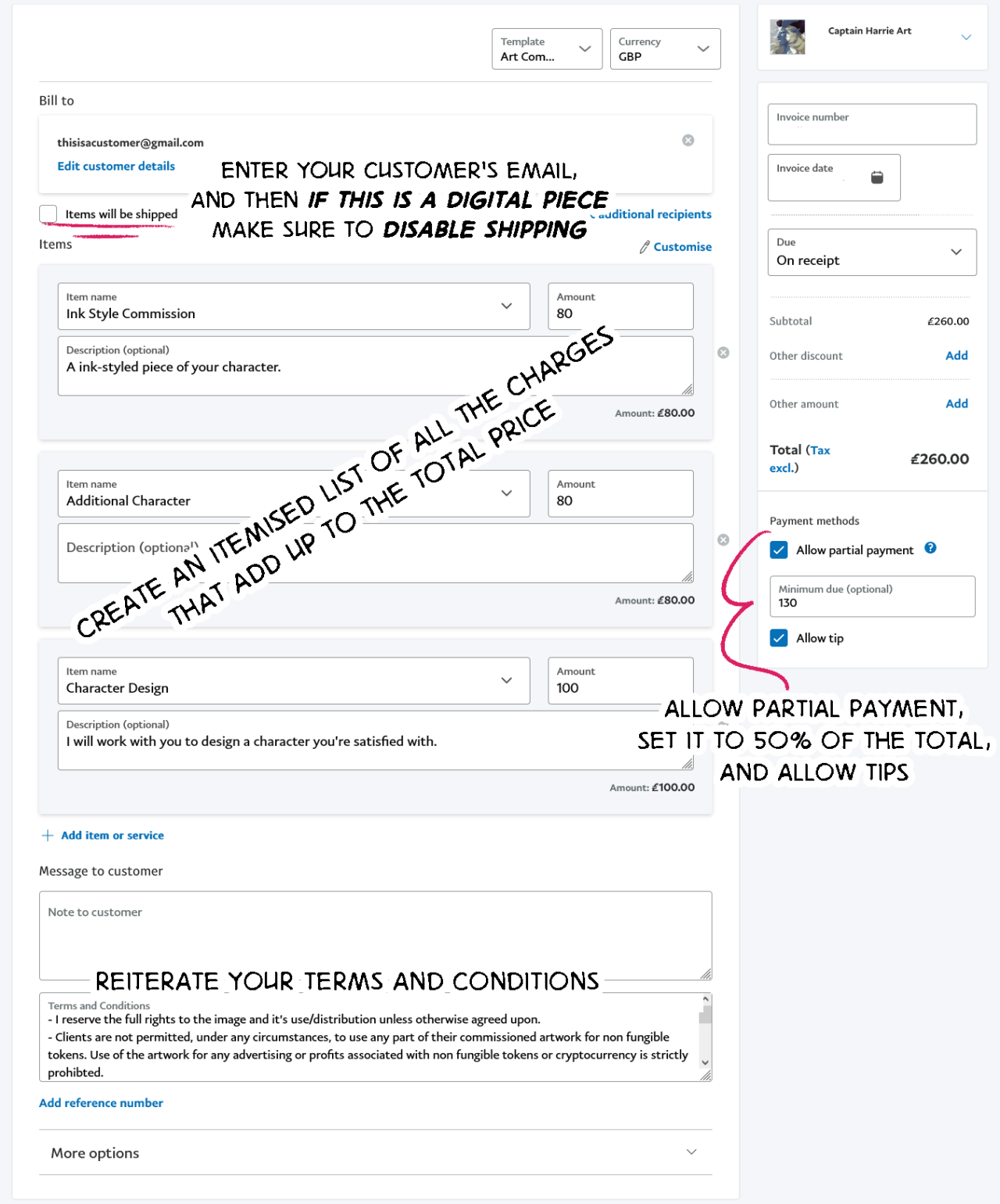
On your commission info or in your terms, make it clear that you require 50% of the payment upfront before you will begin working on the commission.
This protects you from scams where a “client” will make you complete a commission and then never pay for it, but also gives your clients the security that you won’t take all the money and run, either.
Here is an example of what to write irt your payment and process from my own info:
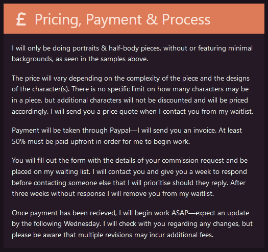
Note the explanation of the payment processor I will be using, expectations on what may influence the price, when to expect to hear from me, and that multiple revisions may incur additional fees.
As a note, should you require to charge additional fees after you’ve already begun and been paid, you should create a new invoice with the additional fees for the revisions and not continue until the fee has been paid.
–
And that’s all my advice, I think! Best of luck to anyone taking commissions, I hope this is helpful.
You can also find this post on Tumblr.
Prelude
For me personally, it's very important to me that my characters feel like real people—in both how I write them, and also what they look like.
It's not necessarily about them being realistic (although my art has certainly taken a more realistic slant as of late and that is related)—I mean, a significant chunk of them are demons, they're certainly not realistic I am very much making fantasy characters—but that they feel like.. People.
Like they've lived the lives that they've lived, and it has made them who they are, and like you could just kind of? Meet a person like that, under the right circumstances?
It's like... I don't really ever see myself in media, and the people I love, my friends, my family, there's such a wide variety of people I know that I really am not seeing reflected back? And this void is what makes me want to create in the first place. It's a void that shouldn't be there.
So, if people can see themselves in my art, people like myself, my mother, my friends, those who are so often told they should not exist at all, then I've succeeded at something, I think. It's a philosophy so intrinsic to my design process that it's impossible to talk about my approach without talking about this first, as it underpins every decision that I make!
Phase 1: Body
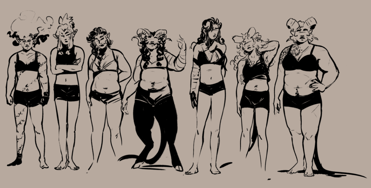
So when I design a character I have at least some vague idea of the kind of life that theyve lived and the sort of person that they are. This effects their physique to some extent, i.e. It determines whether or not I make them buff (my characters who sail, for example, have more muscle mass than those that don't), but also importantly it effects how they carry themselves.
A character's body language is one of the very first things I think about—how a character moves, how they interact with the world, to me it's the core of depicting them as a person. We talk a lot about silhouette in character design, an oft forgotten part of this I feel is the character's body language!
As an example here are some of my girlies—physically they have various different physiques, but even those who are similar have different ways of holding themselves.
Phase 2: Face
A characters face I put a lot of thought into—I try to think of a face that I haven't really drawn before. It's not so much that I'm avoiding "same-face" so much as everyones face is just so wonderfully different, you know? Some faces have sharper features, some are softer, some faces look older and some younger... It's fun to explore the different kind of faces there can be :)
I know it's pretty common to have faceclaims for your characters, but personally I don't really have those—I just think about the different kind of features I've seen and combine them to create new faces... A little bit like making miis, honestly. But with like, real people faces. (Even when my work was more abstracted I was still thinking of real people faces!)
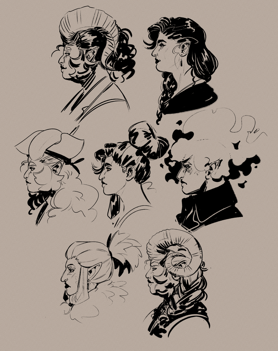
My hot tip: the nose carries in it so much life and character, and shapes the rest of the face! It is into a character's eyes and nose that I put the most thought, personally.
A lot of art seems to kind of diminish the nose until its almost not there (including a lot of my own older art), but personally speaking I have a big nose... And every time I draw a new nose it delights another person who has a similar nose :) So I'm doing my best to get better at drawing them 😤
Phase 3: Outfit
Tip: while figuring out designs especially for outfits and hairstyles, I use the symmetry ruler to save some time while I try new things. I disable snapping when I want to break the symmetry! I like to have a mix of symmetrical and asymmetrical elements in a design.
A fun place to add some asymmetry is in the hair, but symmetrical hairstyles are easier to figure out from different angles... I dont have any specific advice for designing hairstyles I just go buckwild and make it look like theres logic to it after the fact LMAO..
Anyway! Let's actually talk about shapes!
The majority of my characters have multiple outfits—I simply like to dress up my little guys ❤️ but every character starts with one outfit, their hashtag #look if you will, which then influences every other outfit I make them.
My process for designing these outfits is as follows:
-
I first answer this question: what image does this character consciously project?
E.g.: Tempest is a woman who cares a lot about her image and projects an aura of confidence and self assurance, whereas Callisto does not and projects an aura of unimportance and humbleness.
Ergo Tempest's outfit is carefully chosen by herself to create the image she wants to project and is bold and eyecatching, whereas Callisto does not want to draw attention to herself and as such she wears much more subdued clothing.
-
Then it's time to open up Pinterest
By this point in time I know who this character is or at the very least their concept, and ergo I have a solid idea about what their aesthetic vibe is E.g. Pirate, fruity wizard, goth, etc. So I open up pinterest and I begin to make a fashion board for this character.
I look at a mixture of real world fashions both modern and historical for this, as well as LARP fashion for that specific fantasy flavour. It's a good idea to draw from a wide variety of influences, including those that do not fit the specific vibe you are going for.
Note: I do not look at other fantasy/concept art for this.
The reason is, quite a lot of fantasy art is like a one-time image, and a lot of concept art is very removed from reality, so a lot of the time things only work from one specific angle and don't have any underlying logic to them.
Being that all my characters are created for a comic, I need to be able to draw them from any angle. I am not a costume designer, I do not know how to make clothes. But looking at real life clothing ensures everything I design is at least drawing inspiration from something that can be physically worn, so it gives my outfits some grounding in reality.
The further abstracted your sources get, the less grounded in reality your designs will become—which for me personally and my specific tastes and goals, is not desirable.
-
Look for recurring motifs in what makes up the specific aesthetic vibe you're going for
(e.g. Pirates: fancy jackets, loose cotton shirts, sashes and belts)
-
Fashion is all about the shapes you create with the clothes that you wear.
Different fashion trends are all about what shape is currently considered "in"—it's not about "high waisted pants", its about the new shape that the higher waistband creates.
To create fantasy outfits that feel fresh, look at current and past fashion trends and figure out what shape theyre creating—then recreate that using the motifs you found and try use other kinds of clothing not necessarily often used to create this shape.
Tempest's outfit recreates the high waisted shape with a sash tied around her waist. Her loose poet shirt obviously creates the same shape as a loose jumper being tucked in, but I cropped the front of her jacket short and gave it large sleeves to create the same shape.
This is why its good to draw from a variety of influences—it gives you a wider pool of shapes to draw from, and you can then combine them to create something new! I may be designing a pirate character, but the shapes are pulled from modern fashion.
-
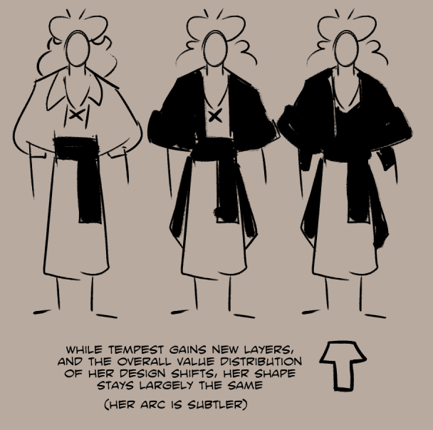
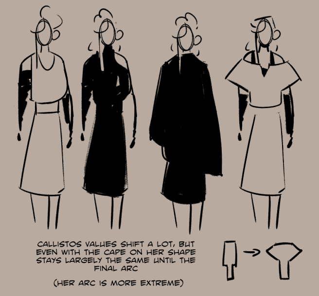
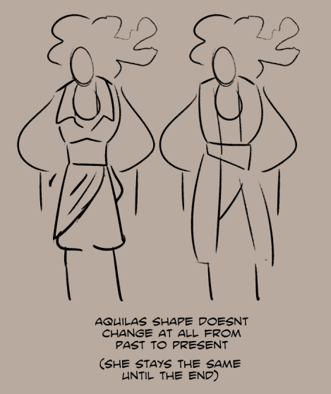
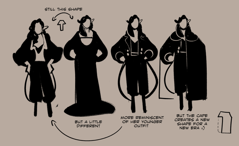
When creating another outfit for a character, using a new shape can be used to symbolise a drastic change, while maintaining the same shape but changing the overall value can symbolise a more subtle shift.
For example, a drastic change of shape can be used to supplement a character arc with a more extreme change, or perhaps supplement a situation wherein there is a drastic shift in how a character is acting or the role they are performing even if they as a person have not changed.
On the other hand, maintaining the same shape but changing the value balance of the outfit can indicate a more subtle change—such as a character slowly letting their walls down! Hairstyle too is great for this, such as a character slowly letting down their hair as the story progresses... A pun and a great way to gradually change their shape :)
Or, another way to put it—keeping the same shape will keep the same general vibe, while changing the shape will create an entirely new vibe.
Here's some examples of this in action!
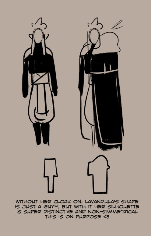
Lavandula is simultaneously a very guarded woman with a very controlled image who does not like to let any of her true self show through, and also a woman who is incredibly transparent and easy to read the second you find the crack in the mask.
She has two very drastically different shapes that she alternates between because she is as a person, very extreme. I wanted her silhouette while wearing her full regalia to be extremely distinct from any other character I have bc she is not in the least bit subtle ❤️
Charity and Rosalie don't specifically have arcs as their story happened in the past and it isnt relevant to the events of Heart of the Storm as their role in this story is a supportive one, but their past is still reflected/contrasted in their current designs!
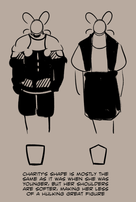
Rosalie especially I think is a good example of using a different shape in a different context to show a shift in how she's acting, but not in her actual arc itself. She just shifts roles for a little bit :)
You can also find this post on Tumblr.
Step 1: Script
Rats squeak and scrounge around on the cold, damp stone floor. There’s a leak in the ceiling, and their wet fur does little to help with the dank, musky smell that permeates the air.
A delicate ear twitches, and the rats scatter—disappearing who knows where.
A door swings open and the dim torch light flickers, “Don’t try any funny business, demon,” a voice spits, accompanied by heavy footfalls that echo through the cold corridor.
“Why,” another voice responds, “I wouldn’t dream of it, darling.” A playful lilt dances its way through the words.
I write my script in prose format, but it really doesn’t matter what it looks like—just that you write one at all! It’s super important!
I read a tweet once, it was aimed at indie game devs:
It’s about the common tendency that independant creators have of starting projects, then getting a new idea that seems so much more exciting than the one that’s currently being worked on.
But more than that, it’s the concept that while an idea is there in your head, it’s filled with infinite possibility—there’s so many different things that it could be, because it isn’t anything at all yet.
But when you start working on it, it ceases to have infinite possibility because suddenly, it already is something.
You could not write anything out at all and jump right into drawing a comic. I’ve done this many times before—I’d be like, “it’s only going to be like four pages, I don’t need to write a script for this!”
But, in going from idea straight to comic, all those infinite possibilities have to suddenly become…just one. And if you find that you didn’t pick the best possibility for that page or that panel…
Take it from me, it’s much harder to rearrange panels you’ve drawn and keep everything fitting on that one page, than it is to rearrange sentences in a text document!
So, I think, it’s important to confront the different ways you could approach an idea as early as possible with the least amount of commitment to one way.
Write it down, feel your idea out!!
Step 2: Find your beats

This is, obviously, a section from a larger script, but I cut it here because it felt like just enough to fit on one page without being too much.
It ended up being 8 beats which, in my experience with the dimensions I work at, at most on a single page I can only fit about 14 panels. That’s really pushing it though, on average my pages will only have 7-8! This one being 8 hits that nice comfortable zone
I prefer to keep the higher panel counts for high activity pages—the more panels you have, the smaller they have to be and thus the less time readers will be focused on them.
If there’s a lot of high action content happening, lots of smaller panels will create that du-du-du rapid fire high action feel, but if it’s a low action page, having lots of panels might make things feel hectic and rushed when it doesn’t want to be!
Too few panels though, and things will feel very slow. I have some pages that only have one to four panels, these are during very slow moments when I want there to be a lingering feeling.
Just something to think about when dividing up your script! For me, 8 is a nice average not-too-much is happening, without being too slow to progress things.
Step 3: divide the page & arrange your beats

So when I’m thumbnailing my comics and figuring out the panel layout, I don’t think of panels as boxes I’m arranging on the page—instead, I’m splitting the page up into sections.
It’s worth bearing in mind, as you read a comic, panels in a row will be read one after the other, but when you go to an entirely new row, your eyes have to go all the way back to the other side of the page.
That means there’s a slight disconnect between the panel on the right side, and the next panel on the left side.
If a series of beats are connected to each other, I try to keep all of them on the same row, and if a beat is not very connected to the other beat before it, I might put its panel onto a new row. As well, I’ll split a panel in half horizontally if they’re directly connected to each other, or if they’re happening at the same time!
But, grouping beats together, then dividing the page into rows that can hold these beats together is how I approach panelling a page
For further reading, I recommend picking up scott mccloud’s books “understanding comics” & “making comics”!
He has a lot of very useful things to say about the different types of panels, how the progression of time works in comics, and stuff like that… essential reads for anyone making comics!
Step 4: Thumbnails time babeyyyy

In writing, the common advice goes “show, don’t tell” this applies to many different aspects of writing, but especially to describing things.
The other advice is to describe using all five senses—sight, sound, smell, touch, and taste.
I prefer to write my scripts in prose format one because I grew up reading a lot of books for one, but for two because I think this is just as important to do in comics as it is in prose.
Of course, we only really have sight and sound to work with, we can’t describe the way something smells or how it tastes because we can only use visuals and the occasional onomatopeia in a comic,
But how you choose to frame your panels will communicate different things.
The dank, musky smell and scent of damp fur may not be something I can tell my readers about in a picture—but if I focus on the puddles on the floor, and show the rats’ wet fur… they’ll feel how dank it is anyway
This is not to say that I think you should write your script in prose—how you write your script is entirely up to you and your personal preferences as I said earlier—what matters is that you write one.
But, while composing the panels in your comic, consider what you’re communicating through them, and whether you’re telling what happens, or if you’re showing your readers what it feels like to be there and what your characters are going through.
It’ll help you compose more interesting pages!
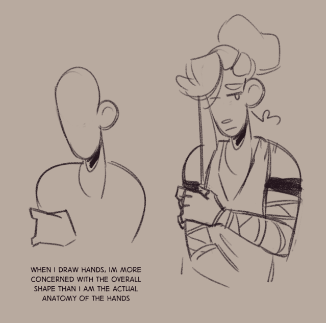
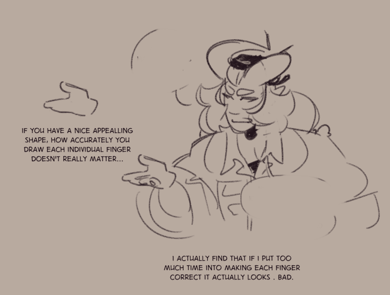
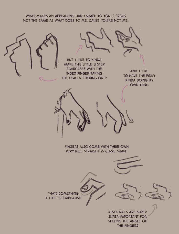
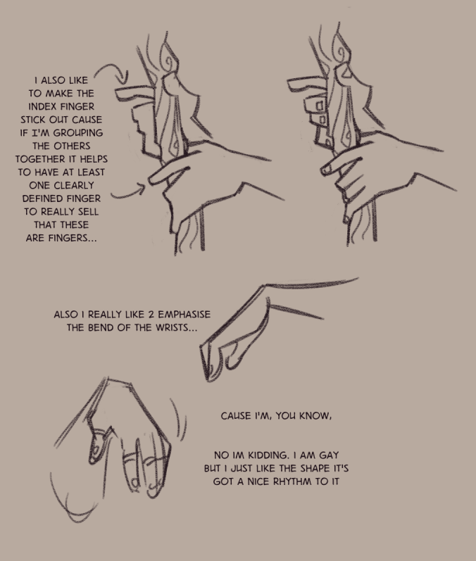
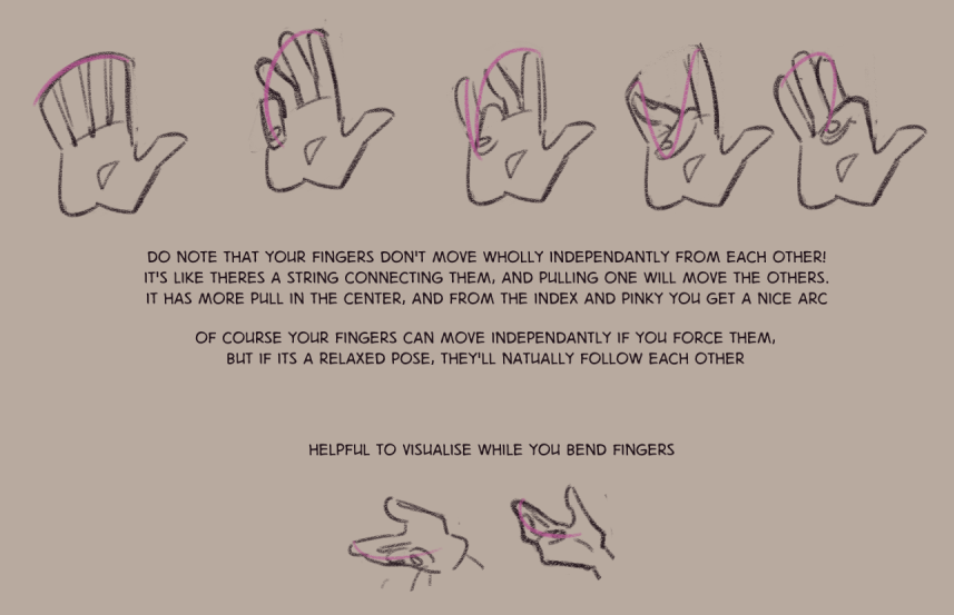
My simplest advice in regards to drawing "Dynamic poses" is this—a dynamic pose is one that's in motion.
Dynamic means to be in a state of constant change, and in a static image your best bet for this is to capture a moment between two different states. Such as in the middle of a cartwheel!
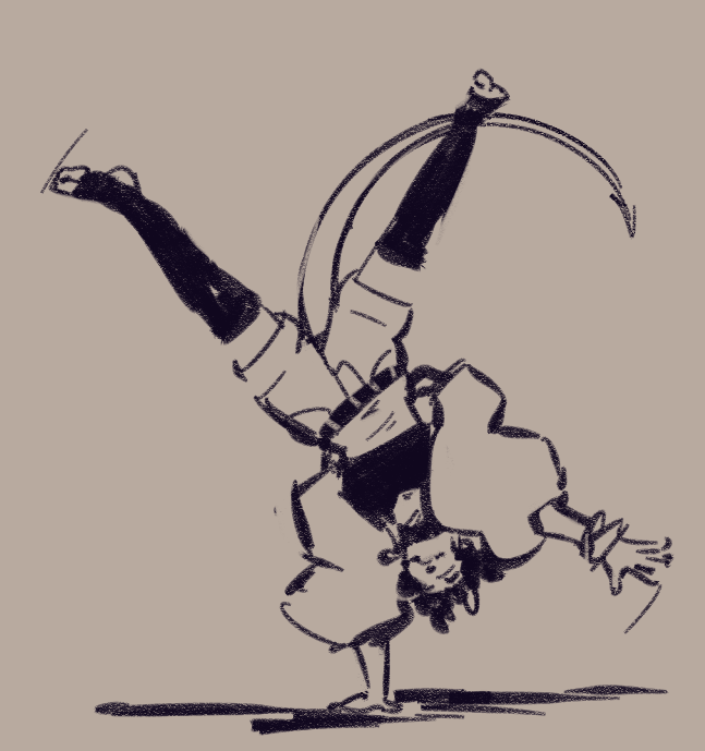
gravity and drag are your greatest tools in conveying motion in a static image.
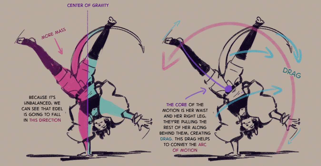
There's enough information here for our minds to process where edel was moments before, and to foresee where edel will go moments from now, thus in our head there's multiple states she could be in, and so the image is dynamic.
Of course, it need not be quite so extreme of a motion, but if you're conveying movement then the pose will be dynamic.
I recommend using live footage as reference instead of working from just photos—a mixture of real time and slow motion would be best! Letting the footage play while you try capturing it is an exercise that teaches you to capture the feeling of the movement, just make sure not to get too bogged down in drawing "correctly" as that'll slow you down. You can always redo and neaten up your favourite sketches later.
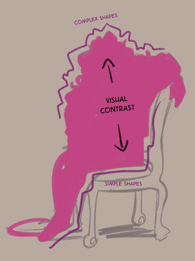
But, the question of how to make poses less stiff and more dynamic is one that I see quite often, and I feel that the actual question people are asking is how to make poses interesting—which is a slightly different topic! A pose can be completely static, and yet still make an interesting image. Tempest isn't going anywhere here, for example:
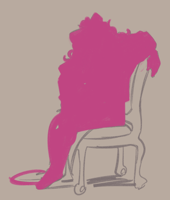
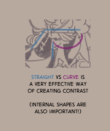
The key is in the overall shape of the pose—you want to create interesting silhouettes (and, ideally, still be able to understand what youre looking at from the silhouette!)
The idea of appealing shape design is something I find incredibly important to learn but particularly hard to teach, because I also believe what constitutes an appealing shape is going to be different for every person, because that's really your voice in art, you know?
But regardless, while I think how you choose to execute it will be down to your personal tastes, the core principle of creating contrast will be universal.
The idea is you're making something interesting to look at, and any way you can create contrasting differences is going to be interesting to look at. Here's my two favourite ways to create contrast in shapes:
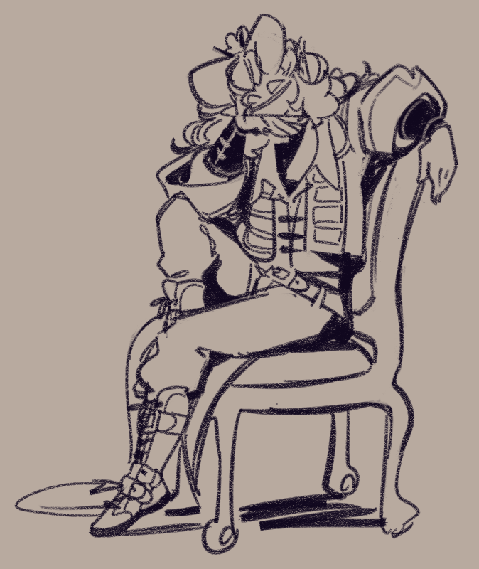
The final, and for me one of the most important parts of posing characters, is their individuality. Conveying their specific personality in how they hold themselves, what exactly it is they're trying to say in how they present themselves, and then showing that through their body language.
I can draw three women in the same chair, but they won't sit the same way and that's interesting, even while completely static!
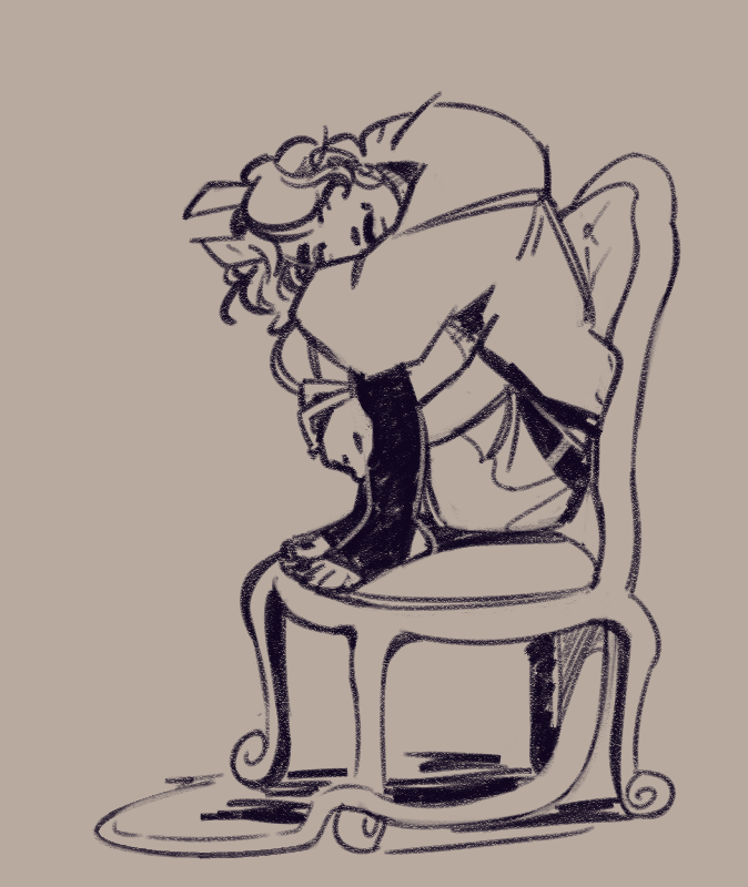
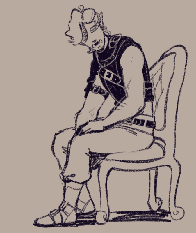
These are various established characters from my stories, but even if you're the type to create a character for a single piece you can still ask yourself—who is this person, what do they want to say about themselves? How would they hold themselves to convey that? What do they say unconsciously? And so on and so forth.
Trying to find answers to these questions will lead you to making interesting posing choices!
art block, writer’s block, “art funk”, “burnout”, yada yada… it’s all the same thing, being a creator and wanting to create but having some kind of a wall preventing you from doing this.
this wall can take a lot of different forms, and i’m going to approach this post from the perspective of a visual artist, but no matter the medium, we all have a skill we’ve trained ourselves in and what I’m talking about will apply regardless.
Anyway as I said there’s a few different forms this wall can take. Here’s a few of them that I can think of:
- Disillusionment with your current skill level
- A loss of direction
- Fatigue
- Lack of drive
It’s really important to identify exactly what your wall is if you want to be able to dismantle it. This isn’t every way it can manifest either, just the most common ways that I see it manifesting, and you might have multiple at once!
Take some time to really self reflect on what the problem is if none of these are resonating after you’ve read the post, whatever it is you can find a way to manage it.
The most common advice I see for “defeating [creator’s] block” is committing to spending like five minutes a day working on something, anything at all. And that’s good advice! but not really for creator’s block, I think.
It’s GREAT advice if you’re lacking in discipline though, like I can easily get distracted and not work on things for months. So committing to work on comic related things for at least 30 minutes a day (and having this commitment be to other people that I’m checking in with each day, i think thats an important part) has worked really well for me, personally.
But I wasn’t dealing with any kind of a block, I just lacked discipline. I don’t think it’s very useful if for example, you hate how your art looks so you don’t want to draw anything anymore lmao
With that in mind, lets go through that list and I’ll try give you some advice from my experiences, and hopefully it’ll help give you the means to identify the problems you’re struggling with and find solutions to them if my advice isn’t quite what you need.
1. Disillusionment with your current skill level
So! it’s time to pull out everyone’s favourite graphic! this version was created by shattered-earth on deviantart, though the original is by Marc Dalessio
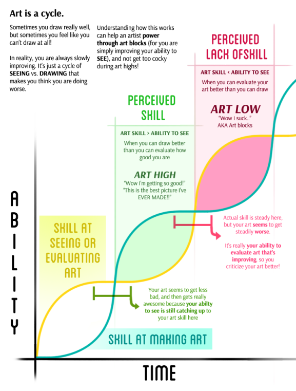
obviously this says art, but again this is applicable to all mediums. It’s an important concept to understand, the idea of a creator’s high vs a creator’s low depending on how developed your critical eye has become compared to your skill level.
If you’re not aware of it and don’t understand what’s happening, it’s REALLY easy to lose all motivation to create anything. Because why bother, if everything sucks? Definitely one of the most dangerous blocks you can run into, I think.
The solution, as with all of these walls, is to be kind to yourself.
Your critical eye improving is emotionally taxing, but it’s also an opportunity for great growth! It’s not easy, though. To get through it, you have to really confront what you don’t like about your work and target your weaknesses, and then you have to put in the time to try and improve them. That’s tough.
But self study doesn’t have to be a solo activity. Talk with your friends, seek out communities of creators, and follow resource blogs, channels, etc. I really think the best thing you can do is surround yourself with other creators, I’m in a few discords and hang out in the creative section of various forums etc
But this is really important: The act of targetting your weaknesses in order to improve them is going to make it REALLY easy for you to lose track of what you like about your work, and can in fact compound the issue and make you only focus on your flaws.
So, be kind to yourself. If you’re not happy with what you create, take the time to critically analyse your work. What don’t you like? What do you like? Don’t lose track of what you like while you study the things you’re less confident about, and with some patience and work your skill will catch up with your eye again.
I really can’t emphasise enough how important it is to not lose track of what it is you like about your work. The biggest motivation killer is always going to be falling out of love with your work, so do everything you can to prevent yourself losing the joy of creating.
Like, sure, a work might be technically perfect, but did you enjoy yourself while creating it? If you always ensure the answer to that is yes, the mismatch between your critical eye and your skills will be easier to handle because at least you’re still enjoying yourself, you know?
2. Loss of direction
An issue you might run into while spending all this time studying your weaknesses and improving your skills, is a lack of direction with your work.
Your technical skills are improving, but you’re just not happy about where your art is going and you’re left with this generally disatisfied feeling despite not seeing anything technically wrong with what you’re doing.
Thankfully this isn’t too difficult to solve once you’ve identified it! Take some time to gather up works by others that really resonates with you, and look back at your own work and pick out the things you like. Then spend some time contemplating, something about it all really hits. What is it? If you can find it, if you spend time trying to really capture it, you’ve found a direction again. Hold onto that, and if you ever find yourself losing your way, go through the process all over again!
A hurdle you might run into with this is, like, if you’ve focused on developing a particular style for your work. Don’t be afraid to try something new while you try capture what resonates with you, you don’t have to pigeonhole yourself into one way of working if it isn’t bringing you joy any more!
And also, don’t be afraid to try something COMPLETELY new. I’m by and large a 2d visual artist, but sometimes I just need to do something different. So i explore things like 3d modelling, I don’t really post my writing but I do do a lot of it for comics work, and i’d like to dabble a little more in music………… anyway point is, try something new if you’re bored LOL
i think there’s a lot of value to be had in trying out something you have no/less experience in. Like, when your focus on one particular skill that you’re really good at, you set your standards higher and higher and its exhausting reaching them all the time.
Picking up a new skill you have no experience in whatsoever, it gives you opportunity to just be really bad at something and have fun with it, and also, you get to have the joy of improving again because it’s so much easier to improve at something you don’t have a lot of experience with!
It doesn’t even need to be a creative skill, I just think it’s nice to step away and do something different for a while. You might find your new direction doing this, or in stepping away from things for a while you might remember what drew you to your original medium in the first place, and you’ve regained your direction.
3. Fatigue
Fatigue is a rough one. As I said before the solution to all of these is to be kind to yourself, and that very much applies here.
Personally speaking, my unmedicated adhd is at constant war with my chronic fatigue and general health so I have this tendency to work in really intense bursts and be left with long periods of exhaustion after the fact. Not ideal!
My personal solution for balancing out my intense drive to create things and my very limited amount of energy was to heavily strip back my process. The best way for me to explain this is probably like… i took the standard art process:
rough sketch > cleaned sketch > lineart > colours > shading
and I wentrough sketch > cleaned sketch > lineart > colours > shading
in other words, I stopped doing anything beyond a sketch and just spent time trying to improve my line quality so that my rough sketches would be clean sketches, thereby turning 5 steps into one single step. Which meant i could get ideas out with the energy level i had!
and then a couple years ago, missing working in colour but rarely ever having enough energy to colour my sketches, I went
rough sketch > cleaned sketch > lineart > colours > shading
which is to say, i just stopped drawing lines entirely which let me work in colour again.
Now, like, this is a very personal solution to dealing with my fatigue. I can’t really tell you how to manage your own, because I think it requires identifying
- what about your work it is that you need to convey what it is you’re trying to capture.
- what about your work is especially taxing and exasperates your fatigue.
And what this means is going to be very different depending on you, and also your particular medium of choice.
But once you figure out what it is that you need and what it is that is taxing you, you can strip everything back so that you only have what you need and the amount of taxing work you’re doing is as minimal as you can make it.
Remember, if your work conveys what you want it to convey, it’s a successful piece regardless as to how polished it is.
So really identify how much you need to do to create a successful piece, and remind yourself that finished is better than perfect.
4. Lack of drive
For me, the reason I have such an intense drive is, like…. if I don’t create what I want to be created, who will? I’ve gotta take matters into my hands if I want to get what I want, you know? Nobody else is gonna cater to me.
So I think, if you’re struggling with finding the drive to create anything, I’d write down the stuff you want to exist.
What is it that you find lacking? What isn’t being created that you want to see? How can you be the one to fill that void? Constantly trying to fill this void is why I never run out of ideas for things to create.
I’m being vague here because it could be literally anything. if you asked 12 year old me id have given you a list of cool dragons i think should exist, and thatd be a great list! because then id have a list of cool dragons to draw (which is what i did most of the time actually)
if you asked me now, id give you a list of character and story concepts, and boy you’ll never guess for what reason i spend all my time writing and making comics LMAO this bitch is GAY and will make GAY BITCHES
So yeah. If you’re struggling to find the drive to create, lacking in ideas and inspiration, sit down and think about what you want to exist that doesn’t exist. you have the power to make that real!! how can you fill that void?? literally any answers you come up for that are ideas you can work with. and the more you tackle it the easier itll get to make ideas.
ANYWAY…………………………………………..
thats my advice on how to get through blocks. i hope it was helpful, and if nothing else helps you realise that creator’s block is not just some nebulous force that you have to wait to go away, but something with a root you can identify and smash to pieces with enough stubbornness and a sledgehammer
You can also find this post on Tumblr.
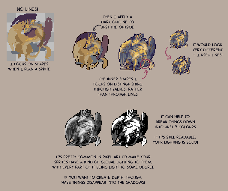
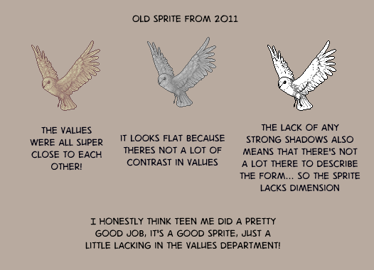
historically, pixel art was rendered on limited hardware, there were strict limits on how many colours could be displayed on screen at once and in a single sprite.
These limits no longer exist, so you are no longer beholden to any of them. Despite what you might hear in certain pixel art spaces, there aren’t really any rules anymore, because there’s no technical limitations forcing you to work a specific way. You can make your pixel art have as many colours as you want, be whatever size you like, and have as many frames as you want it to.
However! the smaller you make a sprite, the harder things will become to read unless you shrink down the number of colours in equal measure.
In a photo you might have. i dunno. 1,000,000 pixels in it or something like that. Thats like a really small photo but that’s still so many pixels that you don’t really notice any of them individually. They all blend together into one big mass to tell you what you’re looking at in groups of hundreds!
On the other hand, in a 16x16 sprite you’ll only have 256 of them. Every single individual pixel can have something to say!
But if every pixel is trying to say something at once, it muddies the sprite and makes it hard to read. However, if a group of pixels are all the same colour, they’re all saying the same thing, and it becomes a lot easier to understand what you’re looking at.
like, for example, take a look at this 16x16 crop of a random photo.

does that look like a whole lot of nothing? yeah . theres 256 pixels, and theres 256 colours. the pixels aren’t really working together to tell you anything, so instead it just becomes one big vague mass. if i reduce the colour count to just 6 colours and increase the contrast, though,

it starts to look less like visual noise, and more like water at sunset!
The contrast is important - part of why you want to keep your colour count low is to make groups of pixels distinct from each other.
But, how exactly do you keep your colour count low, anyway?
a colour ramp refers to the gradient of colours in your palette that are used to shade one particular colour, such as tempests hair or her skin
instinctively you’re probably going to want to make individual gradients of colour for each of these things.
however, if you connect these ramps together, you can greatly reduce the number of colours you’re using in your piece. This also helps create a cohesive palette!
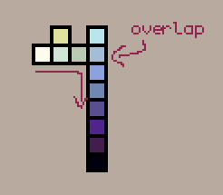
when it comes to connecting ramps, value matters much more than individual hues. you want to have a good range of values to have a readable sprite!
I think actually a really good example of value mattering more than hue in sprites, is this guide to anti aliasing by pixeljoint user ptoing
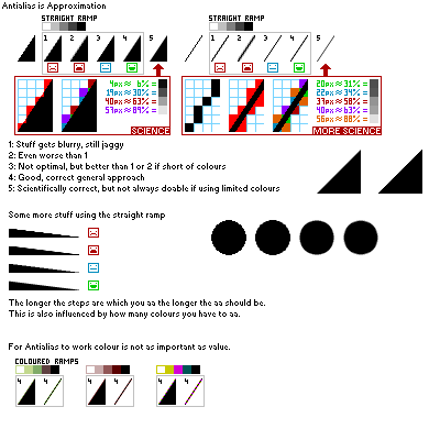
also just generally good advice, but take a look at this bit in particular
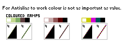
despite the wildly varying hues, they work together just fine. by focusing on the value when you combine your ramps, you can create some really interesting colour palettes!
anyway. now for some vaguer notes on how i do lighting
anyway thems just some thoughts for you all
You can also find this post on Tumblr.
@windup-estinien said:
may be wording this weird but like…how do you take a sketch (with lines) and turn it into a line less piece? it’s something I’ve been struggling with
Well…I must confess, I rarely do this actually ghknghjghj My actual process for working linelessly is… i just dont use any lines sobs
Personally I started working linelessly because I have very limited energy and working with lines would leave me with no energy to colour anything.. so I just dropped the lines altogether—thats why whenever you see me posting stuff with lines its almost always uncoloured. From the way the question is phrased (taking a lined drawing and making it lineless), I feel that taking a similar approach would be a good step, so try foregoing lines altogether.
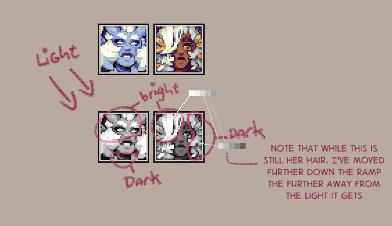
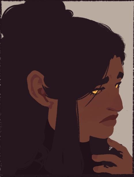
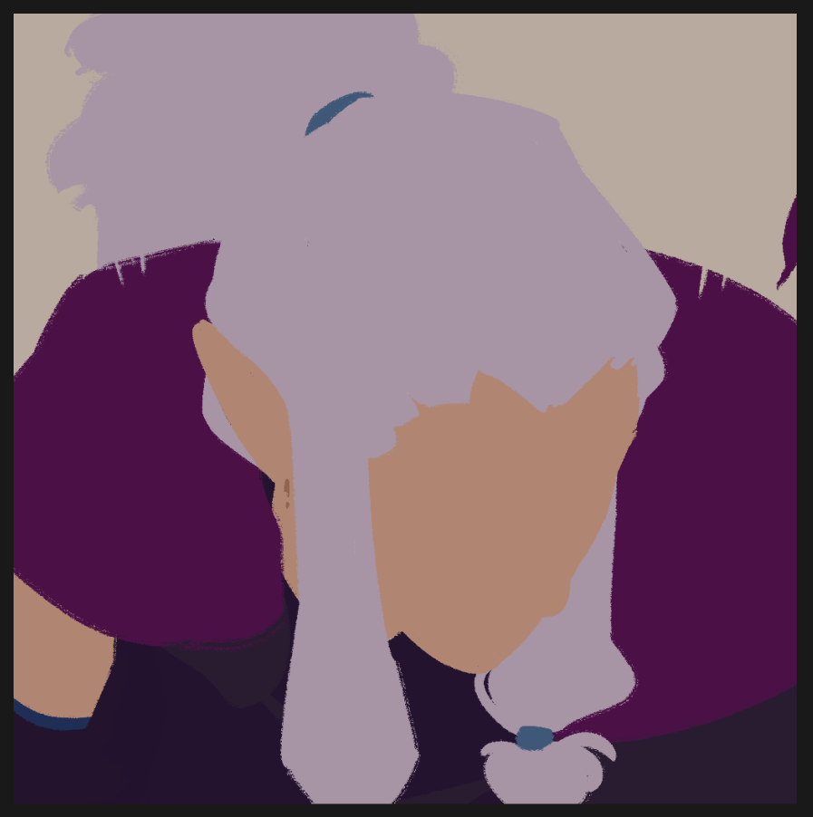
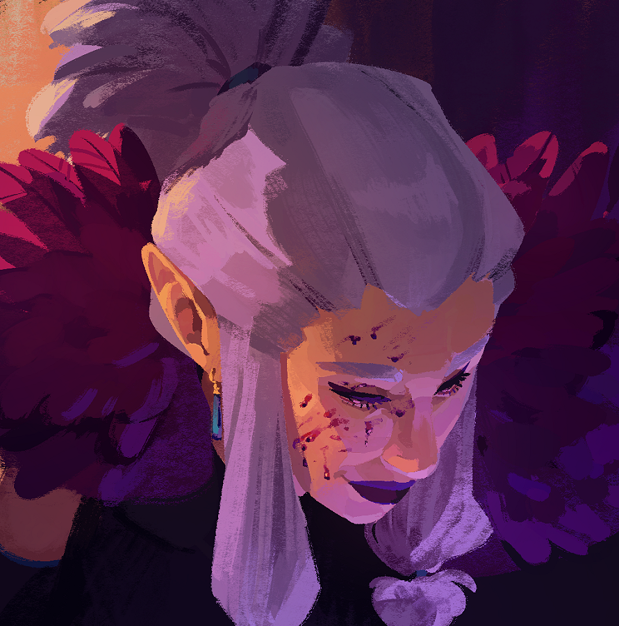
When working without lines, you have to rely on value to create clearly defined shape & form. You need to reframe your thinking a little—while there are no lines here, there is a clearly defined edge by the value difference from her hair & where I've place the shadow. You're not drawing lines, but defining shapes through value difference!
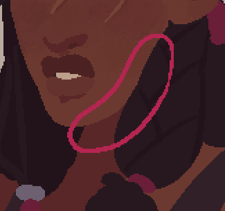
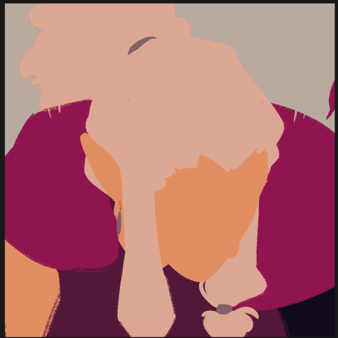
If I run an edge detection filter it creates this. By placing shadows strategically to define the form, there’s no need for me to draw any lines because your brain fills those in for me!
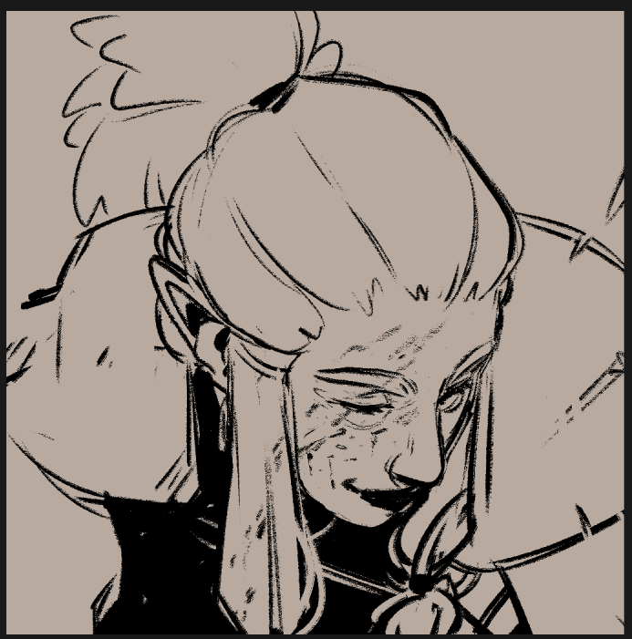
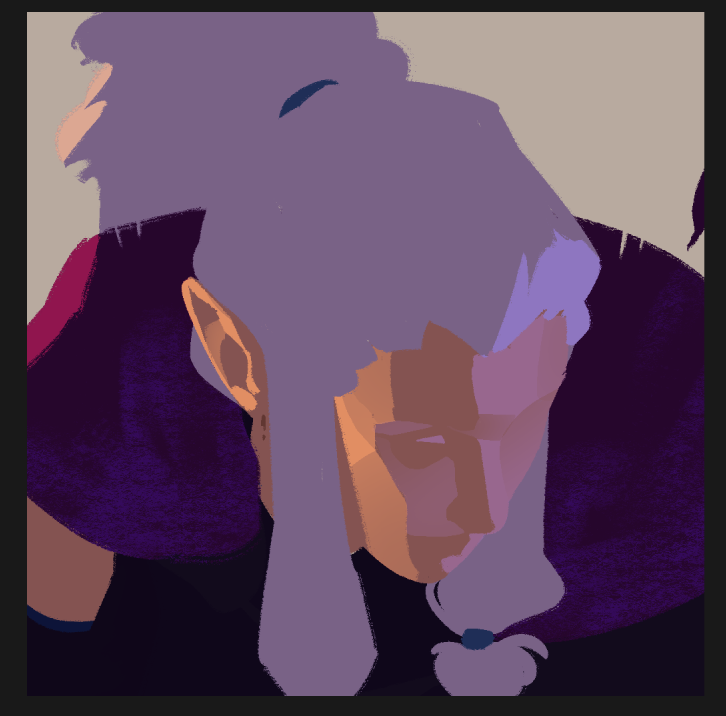
I did actually work with a sketch for the portraits I did recently, you can see that without lines to define any dimension on the flat colours, the distinction between forms is completely lost

it’s through the lighting that I then define everything clearly!
In any case, it’s much easier to take a sketch and make it lineless if you already have experience working linelessly in the first place, so my advice would be to practice drawing without a sketch at all and focusing just on defining shapes and edges through value contrast.
This was written in response to a two part question—unlike the other posts I've written, this is less a collection of thoughts as it is a little insight into one of the many different ways I have of working. I recorded a timelapse of myself painting this portrait, and then broke down the different steps I took to create it. The second part (how I think about colours) has not yet been written. I recommend also reading my thoughts on creating lineless art.
1. after i figure out a sketch im happy with, I usually open up this lighting reference tool and figure out what kind of lighting i want
2. then using my ink brush (which lays down solid colours) I lay out some flats
3. Then I duplicate my flats, and using a curves adjustment layer which I clip to my duplicated flats, I create the light I want
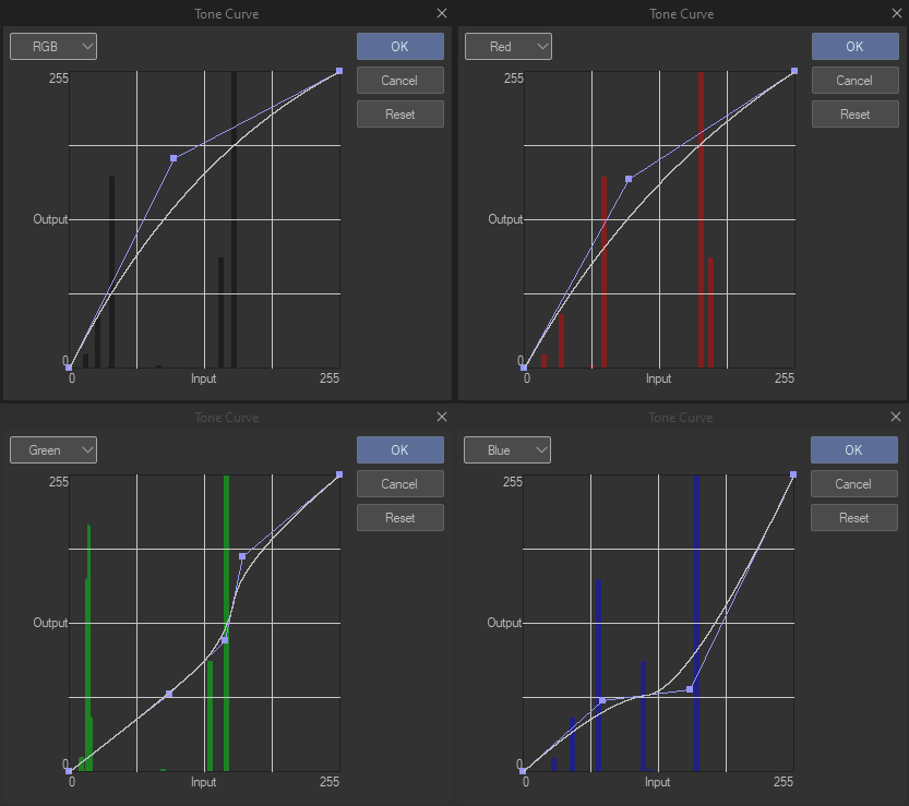
The curves tool is a little hard to explain but like increasing red will make a colour more red while decreasing red will make it more cyan, because cyan is the inverse of red. Then the other two are green and magenta, and blue and yellow. The RGB one will brighten or darken everything, also!
If you play around with it you should start to get a feel for it, I think of colours in relation to how rgb/cmy they are so its just intuitive for me to do lighting this way 😅
4. Anyway I do the same thing again for the secondary light, and then using layer masks I paint in the lighting
I started doing lighting this way because while making comics, it was a lot quicker for me to just make an auto action for “warm yellow light” and “cool blue light” and apply those to a panel and then paint in the light than it was for me to keep picking colours..!
I duplicate the flats when I do this just in case I want to adjust one individual colour, without influencing the shadows.
5. Then I make a new regular degular layer and start painting on top, I initially use my ink brush to do things like her eyes n lips but then I switch to my thick paint brush and enable randomize colour to add a little colour variation to my brush strokes n just go absolutely ham god bless
6. at the very end there i add a little bit of bloom with an overlay layer and an airbrush
7. Not shown in the timelapse, but I later went in and reworked the mantle to actually define the feathers.
Anyway, I hope that was insightful!
You can also find this post on Tumblr.